Full concept creation and execution of Shopify Hydrogen brand.
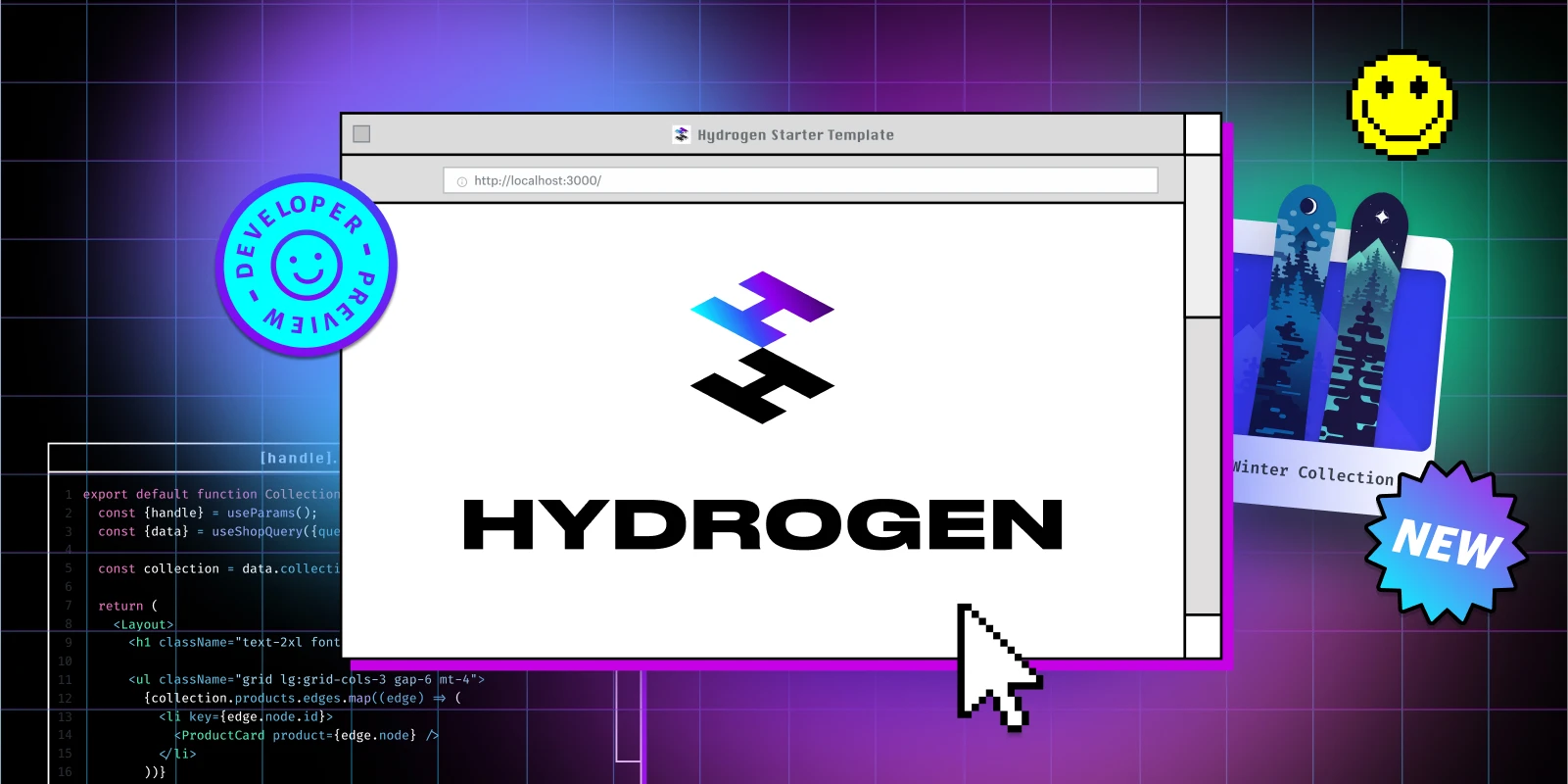
Announcement share image launching Hydrogen.
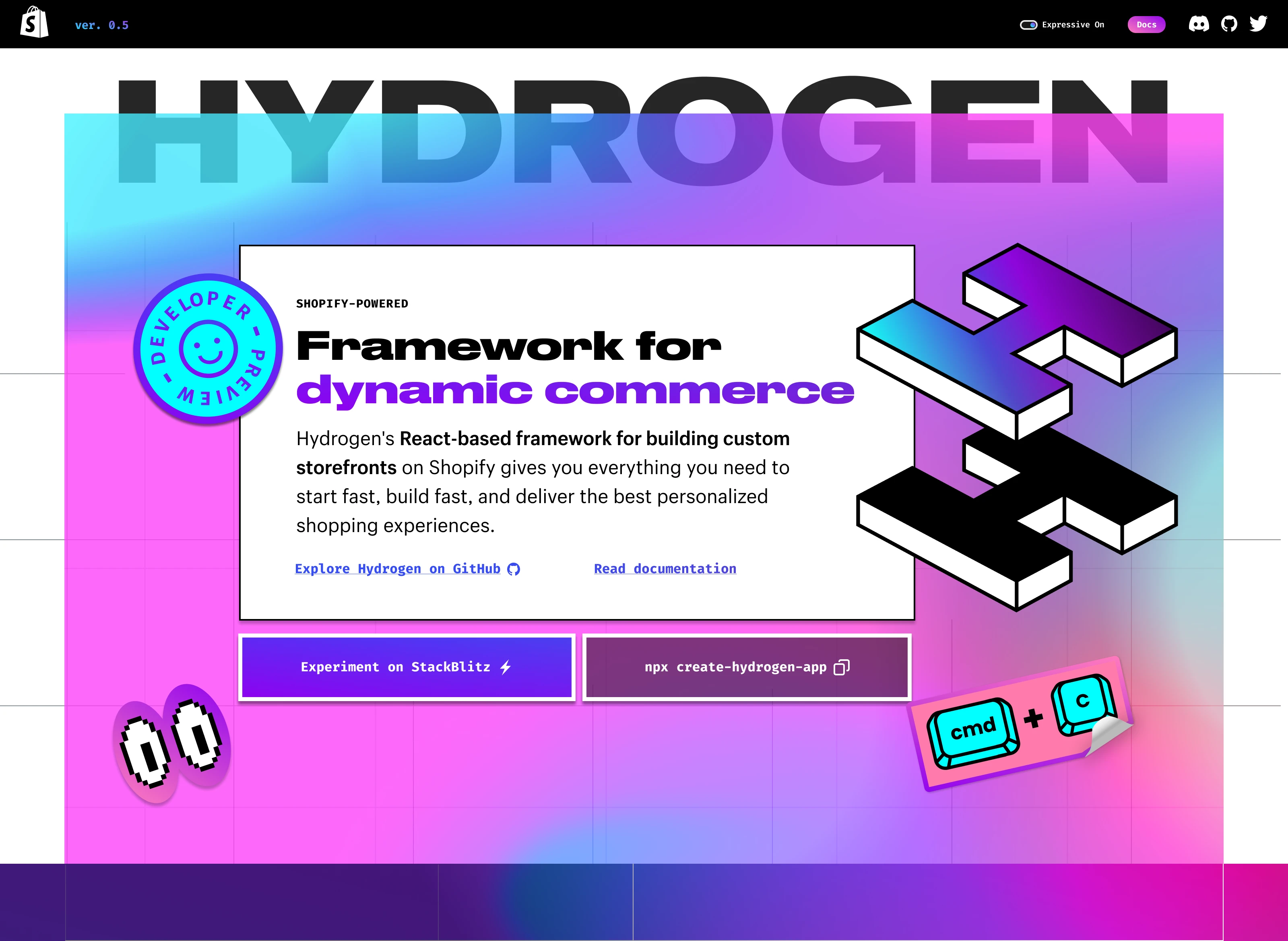
Early version of the Hydrogen landing page hero.
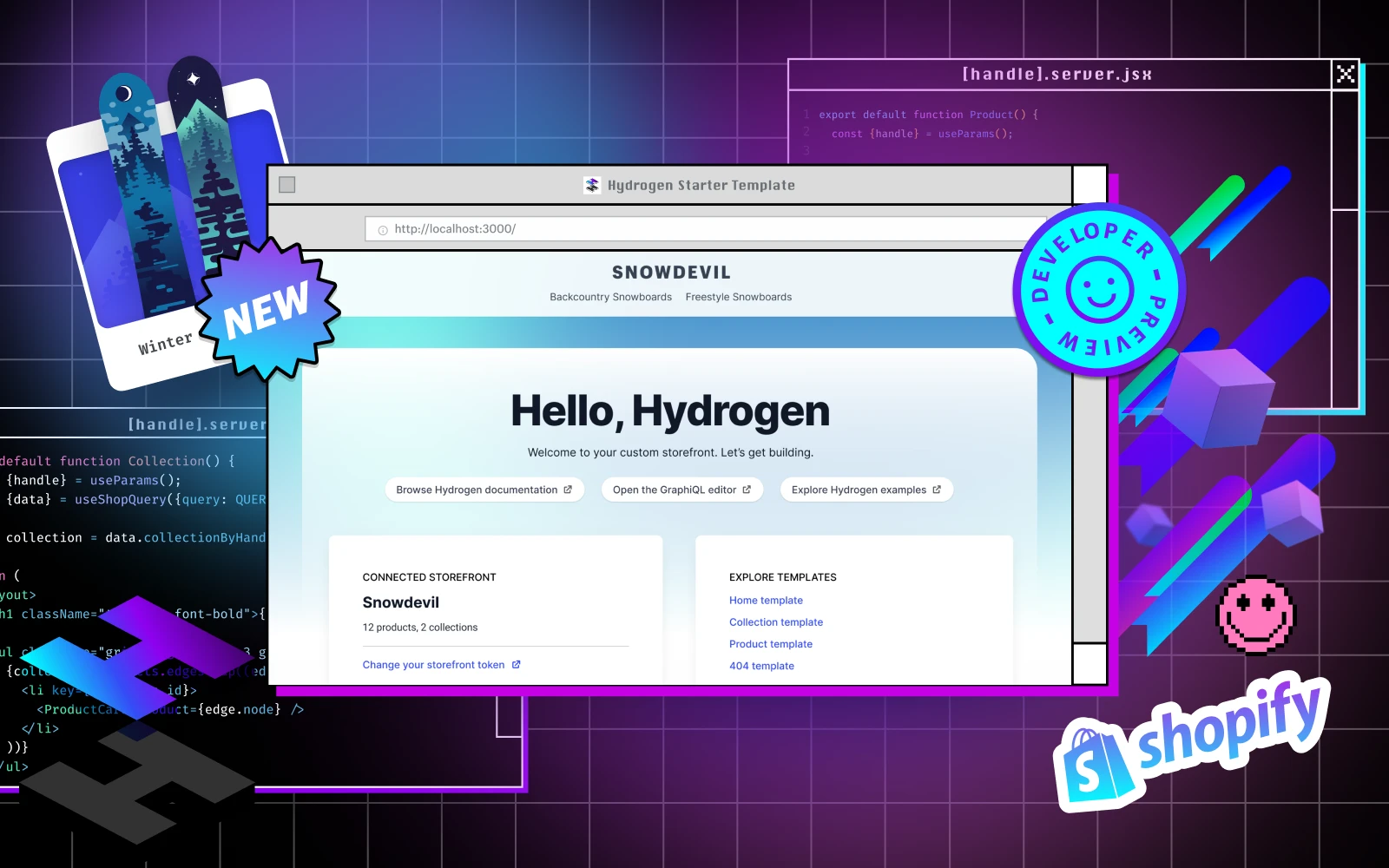
A social share image featuring many motifs of the brand identity: retro-pixel windows, grids, stickers, code windows, and more.
The product is complex, and aimed at experienced developers and headless store builders. Despite its intricate technical capabilities, we wanted to bring in a sense of joy of building in code and pulled imagery inspiration from early web visuals.
Exaggerated mouse cursors, digital pixelated 'stickers' and neon gradients became brand motifs throughout the landing page and social assets.
Since its launch, the Hydrogen brand has continued to evolve but elements of the original essence remain key elements of its brand and visual identity.

The logo is comprised of two floating H’s stacked one on top of the other. H is the symbol for Hydrogen in chemistry, and the two H’s stacked in isometric perspective represent the buildability of composable commerce.
Selected work in graphic design and built spaces—spanning brand identities, installations, and environmental design.
More projects
Full concept creation and execution of Shopify Hydrogen brand.

Announcement share image launching Hydrogen.

Early version of the Hydrogen landing page hero.

A social share image featuring many motifs of the brand identity: retro-pixel windows, grids, stickers, code windows, and more.
The product is complex, and aimed at experienced developers and headless store builders. Despite its intricate technical capabilities, we wanted to bring in a sense of joy of building in code and pulled imagery inspiration from early web visuals.
Exaggerated mouse cursors, digital pixelated 'stickers' and neon gradients became brand motifs throughout the landing page and social assets.
Since its launch, the Hydrogen brand has continued to evolve but elements of the original essence remain key elements of its brand and visual identity.

The logo is comprised of two floating H’s stacked one on top of the other. H is the symbol for Hydrogen in chemistry, and the two H’s stacked in isometric perspective represent the buildability of composable commerce.
Selected work in graphic design and built spaces—spanning brand identities, installations, and environmental design.
More projects
Full concept creation and execution of Shopify Hydrogen brand.

Announcement share image launching Hydrogen.
Client
Shopify
Role
Designer
Year
2022
Service provided
Branding, creative direction, concept creation
Shopify Hydrogen is a headless commerce stack built by Shopify that enables developers to build fast, dynamic, and customizable e-commerce storefronts using React. It's designed to work with Shopify's backend, allowing developers to create unique front-end experiences while leveraging Shopify's ecommerce functionality.
I was on the design team tasked with creating a brand for this new complex product by Shopify. My team went through several rounds of ideation and concept creation, and continuously iterated with feedback from stakeholders.

Early version of the Hydrogen landing page hero.

A social share image featuring many motifs of the brand identity: retro-pixel windows, grids, stickers, code windows, and more.
The product is complex, and aimed at experienced developers and headless store builders. Despite its intricate technical capabilities, we wanted to bring in a sense of joy of building in code and pulled imagery inspiration from early web visuals.
Exaggerated mouse cursors, digital pixelated 'stickers' and neon gradients became brand motifs throughout the landing page and social assets.
Since its launch, the Hydrogen brand has continued to evolve but elements of the original essence remain key elements of its brand and visual identity.

The logo is comprised of two floating H’s stacked one on top of the other. H is the symbol for Hydrogen in chemistry, and the two H’s stacked in isometric perspective represent the buildability of composable commerce.
Selected work in graphic design and built spaces—spanning brand identities, installations, and environmental design.
More projects
